
placeholder attribute.When JavaScript was introduced into web browsers, it was immediately seized upon for two tasks: Image rollovers and form enhancements. When CSS came along with its :hover pseudo-class, web designers no longer needed to reach for JavaScript just to achieve a simple rollover effect.
This is a recurring trend. If a pattern is popular enough, it will almost certainly evolve from requiring a scripted solution to something more declarative. That’s why CSS3 introduces even more animation capabilities that previously required JavaScript.
When it comes to enhancing forms, CSS has its limitations. That’s where HTML5 comes in. Following the same migratory pattern from scripted to declarative solutions, the specification introduces many new form enhancements.
These features were originally part of a WHATWG specification called Web Forms 2.0, based upon existing work at the W3C. That specification has now been rolled into HTML5.
placeholderHere’s a common DOM Scripting pattern, often used for search forms:
The placeholder text is usually displayed in a lighter shade than an actual form field value—either through CSS, JavaScript, or a combination of both.
In an HTML5 document, you can simply use the placeholder attribute (fig 4.01):
<label for="hobbies">Your hobbies</label>
<input id="hobbies" name="hobbies" type="text"
placeholder="Owl stretching">placeholder attribute.The placeholder attribute works wonderfully in the browsers that support it, but, alas, that’s a fairly small subset of browsers right now. It’s up to you to decide how you want to deal with other, non-supporting browsers.
You might decide not to do anything at all. After all, the functionality is “nice to have,” not “must have.” Alternatively, you might decide to fall back on a JavaScript solution. In that case, you need to make sure that the JavaScript solution is only applied to browsers that don’t understand the placeholder attribute.
Here’s a generic little JavaScript function that tests whether an element supports a particular attribute:
function elementSupportsAttribute(element,attribute) {
 var test = document.createElement(element);
 if (attribute in test) {
  return true;
 } else {
  return false;
 }
}
This works by creating a “phantom” element in memory— but not in your document—and then checking to see if the prototype for that element has a property with the same name as the attribute you are testing for. The function will return either true or false.
Using this function, you can make sure that a JavaScript solution is only provided to browsers that don’t support placeholder:
if (!elementSupportsAttribute('input','placeholder')) {
 // JavaScript fallback goes here.
}autofocus“Hi. I’m the auto-focus pattern. You may remember me from such websites as ‘Google: I’m Feeling Lucky’ and ‘Twitter: What’s happening?’”
This is a simple one-step pattern, easily programmed in JavaScript:
HTML5 allows you to do this using the Boolean autofocus attribute:
<label for="status">What's happening?</label>
<input id="status" name="status" type="text" autofocus>
The only problem with this pattern is that it can be annoying as hell. When I’m surfing the web, I often hit the space bar to scroll down to content “below the fold.” On sites like Twitter that use the auto-focus pattern, I find myself filling up a form field with spaces instead.
I can see why the autofocus attribute has been added to HTML5—it’s paving a cowpath—but I worry about the usability of this pattern, be it scripted or native. This feature could be helpful, but it could just as easily be infuriating. Please think long and hard before implementing this pattern.
One of the advantages in moving this pattern from scripting to markup is that, in theory, browsers can offer users a preference option to disable auto-focusing. In practice, no browser does this yet, but the pattern is still quite young. Currently, the only way to disable scripted auto-focusing is to disable JavaScript completely. It works, but it’s a heavy-handed solution, like gouging out your eyes to avoid bright lights.
As with the placeholder attribute, you can test for autofocus support and fall back to a scripted solution:
if (!elementSupportsAttribute('input','autofocus')) {
 document.getElementById('status').focus();
}
The autofocus attribute doesn’t only work on the input element; it can be used on any kind of form field, such as textarea or select, but it can only be used once per document.
requiredOne of the most common uses of JavaScript is client-side form validation. Once again, HTML5 is moving this solution from scripting to markup. Just add the Boolean attribute required:
<label for="pass">Your password</label>
<input id="pass" name="pass" type="password" required>
Theoretically, this allows browsers to prevent form submissions if required fields haven’t been filled out. Even though browsers aren’t doing that yet, you can still make use of the required attribute in your JavaScript form validation. Instead of keeping a list of all the required fields in your script or adding class="required" to your markup, you can now check for the existence of the required attribute.
autocompleteBrowsers don’t simply display web pages. Most browsers have additional features designed to enhance usability, security, or convenience when surfing the web’s tide. Automatically filling in forms is one such feature. Most of the time, it’s very useful, but occasionally it can be annoying or even downright dangerous. I don’t mind if my browser remembers my contact details, but I probably don’t want it to remember the log-in for my bank account, just in case my computer is stolen.
HTML5 allows you to disable auto-completion on a per-form or per-field basis. The autocomplete attribute isn’t Boolean, yet it can only take two possible values: “on” or “off ”:
<form action="/selfdestruct" autocomplete="off">By default, browsers will assume an autocomplete value of “on,” allowing them to pre-fill the form.
You can have your auto-completion cake and eat it. If you want to allow pre-filling for a form but disable pre-filling for just one or two fields in that form, you can do so:
<input type="text" name="onetimetoken" autocomplete="off">There isn’t any JavaScript fallback for browsers that don’t support the autocomplete attribute. In this case, the new HTML5 attribute is augmenting an existing browser behavior rather than replacing a scripted solution.
The ability to disable auto-completion in browsers might seem like a strange addition to the HTML5 specification. HTML5 is supposed to be codifying prevalent patterns and this isn’t a very common use case. But given the potential security risks that auto-completion enables, it makes sense to allow website owners to override this particular browser feature.
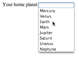
datalistThe new datalist element allows you to crossbreed a regular input element with a select element. Using the list attribute, you can associate a list of options with an input field (fig 4.02):
<label for="homeworld">Your home planet</label>
<input type="text" name="homeworld" id="homeworld" list="planets">
<datalist id="planets">
 <option value="Mercury">
 <option value="Venus">
 <option value="Earth">
 <option value="Mars">
 <option value="Jupiter">
 <option value="Saturn">
 <option value="Uranus">
 <option value="Neptune">
</datalist>
This allows users to select an option from the list provided or to type in a value that isn’t in the list at all. This is very handy for situations that would normally require an extra form field labeled, “If ‘other’, please specify …” (fig 4.03).
datalist element.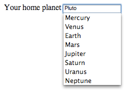
datalist element, showing that the user can type in a value that is not in the list.The datalist element is a nice, unobtrusive enhancement to a form field. If a browser doesn’t support datalist, then the form field behaves as a normal input.
The type attribute of the input element is being greatly expanded in HTML5. There are so many cowpaths to pave, it’s like doing construction work in the aftermath of a stampede.
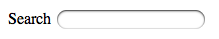
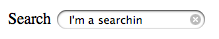
An input element with a type value of “search” will behave much the same way as an input element with a type value of “text”:
<label for="query">Search</label>
<input id="query" name="query" type="search">
The only difference between “text” and “search” is that a browser might display a search input differently to be more consistent with the styling of search fields in the operating system. That’s exactly what Safari does (fig 4.04).
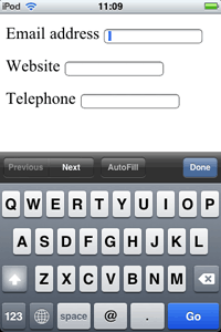
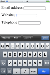
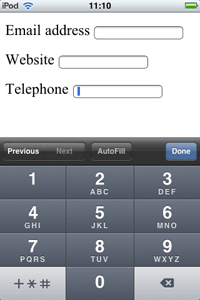
There are three new type values for specific kinds of contact details: email addresses, websites, and telephone numbers:
<label for="email">Email address</label>
<input id="email" name="email" type="email">
<label for="website">Website</label>
<input id="website" name="website" type="url">
<label for="phone">Telephone</label>
<input id="phone" name="phone" type="tel">
Once again, these fields will behave in the same way as text inputs, but browsers now have a bit more information about the kind of data expected in the field.
Safari claims to support these new input types but a quick look at a form in the desktop browser reveals no differences to simply using type="text". However, if you start interacting with the same form in Mobile Safari, the differences become apparent. The browser displays a different on-screen keyboard depending on the value of the type attribute (fig 4.05).
type attribute.Subtly played, Webkit, subtly played.
Many JavaScript libraries offer pre-built widgets that you can use in your web applications. They work fine—as long as JavaScript is enabled. It would be nice if our users didn’t have to download a JavaScript file every time we want to add an interesting control to our pages.
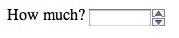
A classic example is a slider control. Until now, we’ve had to use JavaScript to emulate this kind of interactive element. In HTML5, thanks to type="range", browsers can now offer a native control:
<label for="amount">How much?</label>
<input id="amount" name="amount" type="range">
Both Safari and Opera currently support this input type, offering similar-looking controls (fig 4.06).
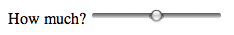
By default, the input will accept a range from zero to one hundred. You can set your own minimum and maximum values using the min and max attributes:
<label for="rating">Your rating</label>
<input id="rating" name="rating" type="range"
min="1" max="5">
That’s all well and good for Safari and Opera users; other browsers will simply display a regular text input. That’s probably fine, but you might want to use a JavaScript fallback for browsers that don’t support type="range".
Testing for native support of input types requires a similar trick to the test for attribute support. Once again, you will need to create a “phantom” input element in memory. Then, set the type attribute to the value you want to test. When you query the value of the type property, if you get back a value of “text,” then you’ll know that the browser doesn’t support the value that you set.
Here’s some sample code, although I’m sure you can write something far more elegant than this:
function inputSupportsType(test) {
 var input = document.createElement('input');
 input.setAttribute('type',test);
 if (input.type == 'text') {
  return false;
 } else {
  return true;
 }
}
You can then use this function to ensure that a JavaScript widget is only provided to browsers that don’t natively support a particular input type:
if (!inputSupportsType('range')) {
 // JavaScript fallback goes here.
}
A native input control will certainly load faster than a scripted solution that needs to wait until the DOM has finished loading. A native control will also usually be more accessible than a scripted control, although—bizarrely—Safari’s range control currently isn’t keyboard-accessible!
A browser-native range control doesn’t expose the underlying value to the user. Instead, the number is translated into the graphical representation of a slider widget. That’s fine for certain kinds of data. Other kinds of data work best when the user can see and choose the numerical value. That’s where type="number" comes in:
<label for="amount">How much?</label>
<input id="amount" name="amount" type="number"
min="5" max="20">
As well as allowing the user to input a value directly into a text field, browsers can also display “spinner” controls to allow users to increase or decrease the value (fig 4.07).
type="number" is used.The number input type is a hybrid of text and range. It allows users to enter values directly, like a text field, but it also allows browsers to ensure that only numerical values are entered, like a range control.
One of the most popular JavaScript widgets is the calendar picker. You know the drill: you’re booking a flight or creating an event and you need to choose a date. Up pops a little calendar for you to choose a date from.
These calendar widgets all do the same thing, but you’ll find that they’re implemented slightly differently on each site. A native calendar widget would smooth away the inconsistencies and reduce cognitive load during the date-picking process.
HTML5 introduces a raft of input types specifically for dates and times:
date is for a year, month, and day.datetime is for a year, month, and day in combination with hours, minutes, and seconds and time zone information.datetime-local is the same but without the time zone information.time is for hours, minutes, and seconds.month is for a year and a month but without a day.All of these input types will record timestamps with some subset of the standardized format YYYY-MM-DDThh:mm:ss.Z (Y is year, M is month, D is day, h is hour, m is minute, s is second, and Z is timezone). Take, for example, the date and time at which World War One ended, 11:11am on November 11th, 1918:
date: 1918-11-11datetime: 1918-11-11T11:11:00+01datetime-local: 1918-11-11T11:11:00time: 11:11:00month: 1918-11There is no year input type, although there is a week input type that takes a number between 1 and 53 in combination with a year.
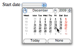
Using the date and time input types is straightforward:
<label for="dtstart">Start date</label>
<input id="dtstart" name="dtstart" type="date">
Opera implements these input types using its patented ugly-stick technology (fig 4.08).
As always, browsers that don’t support these input types will fall back to displaying a regular text input. In that situation, you could ask your users to enter dates and times in the ISO format or you could use your JavaScript library of choice to generate a widget. Make sure to check for native support first:
if (!inputSupportsType('date')) {
 // Generate a calendar widget here.
}
Even the most elegantly written JavaScript calendar widget is going to require some complex code to generate the table of days and handle the date-picking events. Browser-native calendar widgets should be considerably smoother and faster, as well as being consistent from site to site.
Perhaps the most ambitious widget replacement in HTML5 is the color input type. This accepts values in the familiar Hexadecimal format: #000000 for black, #FFFFFF for white.
<label for="bgcolor">Background color</label>
<input id="bgcolor" name="bgcolor" type="color">
The plan is for browsers to implement native color pickers like the ones in just about every other application on your computer. So far, no browsers have done this but when they do, it will be, like, totally awesome.
In the meantime, you can use a JavaScript solution, but be sure to test for native support, so your code is future-proofed for tomorrow’s browsers.
All of these new input types serve two purposes: they allow browsers to display native controls suited to the expected input data, and to validate the value entered. These additions to HTML5 cover the majority of scenarios, but you still might find that you need to validate a value that doesn’t fall under any of the new categories.
The good news is that you can use the pattern attribute to specify exactly what kind of value is expected. The bad news is that you have to use a regular expression:
<label for="zip">US Zip code</label>
<input id="zip" name="zip" pattern="[\d]{5}(-[\d]{4})">
Most of the time, you’ll never need to use the pattern attribute. On the occasions that you do, you have my sympathy.
Forms have been given a huge boost in HTML5. Much of the burden that has traditionally been carried by JavaScript is shifting onto the shoulders of markup. Right now, we’re in a transitional phase where some of that functionality is supported by some browsers. We can’t ditch our JavaScript just yet, but we’re not too far away from a brighter future.
Client-side validation is going to get a whole lot easier— although you shouldn’t ever rely on it; always validate form values on the server as well. Generating form controls will no longer require that your users download a JavaScript library; it will all be handled natively in the browser.
I’m sure you can see the benefits to having native browser controls for calendars and sliders, but I bet you’re wondering: “Can I style them?”
It’s a good question. For the time being, the answer is “no.” Take it up with the CSS Working Group.
This might be a deal breaker for you. If you feel that a particular browser’s implementation of a form element is less than finessed, you might prefer to use a JavaScript widget that gives you more control.
I’d like you to think about a different question: “Should I style them?”
Remember, the web isn’t about control. If a visitor to your site is familiar with using a browser’s native form doodad, you won’t be doing them any favors if you override the browser functionality with your own widget, even if you think your widget looks better.
Personally, I’d like to see browser vendors competing on the prettiness and usability of their HTML5 form controls. That’s a browser war I could support.
Let’s put forms to one side now, and take a look at the juicy new semantics in HTML5.
Semantics